Accessibility is not only the act of making content available to a vast number of people, but it is more so the fact of making content on any platform available to everyone qualified to benefit from it. This includes especially those with an impairment of either a physical, mental, or psychological nature (King & Piotrowski, 2021).
The prevalence of technology today has imposed on designers to consider the needs of the users of various strands. This means considering the accessibility of the software programs they are designing for those with disabilities. It is a moral responsibility and a legal imperative (Huss, 2022). Up to 12 percent of the US population is people considered disabled in one way or the other.

As a result, it is also a good marketing strategy to cater to the needs of this segment (King & Piotrowski, 2021). Programs like MS Word that are universally used for word processing need to adhere to accessibility requirements to address the legal imperatives and market demands of a growing population.
In this context, we analyze a simulated MS Word document to determine its accessibility. The Headings of the instructional component of the Accessibility Resource document mostly comply with accessibility requirements because they use Cambria font for the title and Level 1 Headings. When it continues to Level 2 Headings, the writer still wants to impose a Level 1 Heading, which would not fit the document’s structure, although it may seem visually allowable. The text used in the body paragraphs of the simulation section is Arial, which is uniform all through. These are the two elements that are accessible in the entire document.

Modifications
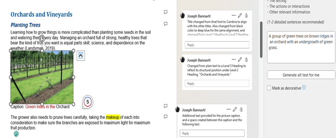
The text color, headings in the simulation, alternative text, lack of spacing between paragraphs, insufficient picture captions, and lack of captions in some images are some of the accessibility issues in which the document is deficient.
To make the document accessible, the red text color was changed to blue, headings in the simulation were given their logical position in the document structure, making sure there were no skipped level headings, alternative text was introduced into the document, and spacing was created between paragraphs. Insufficient (single-word) image captions were made more explicit by adding a few descriptors. There were no captions in some cases, so they were added to the images. In most cases, the accessibility mechanisms were available in Word- whether to change text color, add Alt text, add comments, or change Headings or font type and color. It was a matter of using WebAim for guidance to identify the proper process.
I recommend WebAim.org, Word 365 and 2019 for Windows; Microsoft support website – how to make your Word documents accessible to people with disabilities; Userway’s Next-gen Web Accessibility.
BEFORE


AFTER


References
King, C., Piotrowski, C. (2021). Navigating the ADA accessibility Requirements and legal pitfalls in online education. College Student Journal, 5(2), 127–134.
Huss, J. A. (2022). A high school website Is a school community’s communication center…but is it ADA compliant? School Community Journal, 2022, Vol. 32, No. 1 http://www.schoolcommunitynetwork.org/SCJ.aspx
Web Accessibility in Mind (WebAIM) https://webaim.org/techniques/word/word365win
Leave a comment